Design Systems
Building LinkedIn's First Design System: Scaling for Web, iOS, and Android
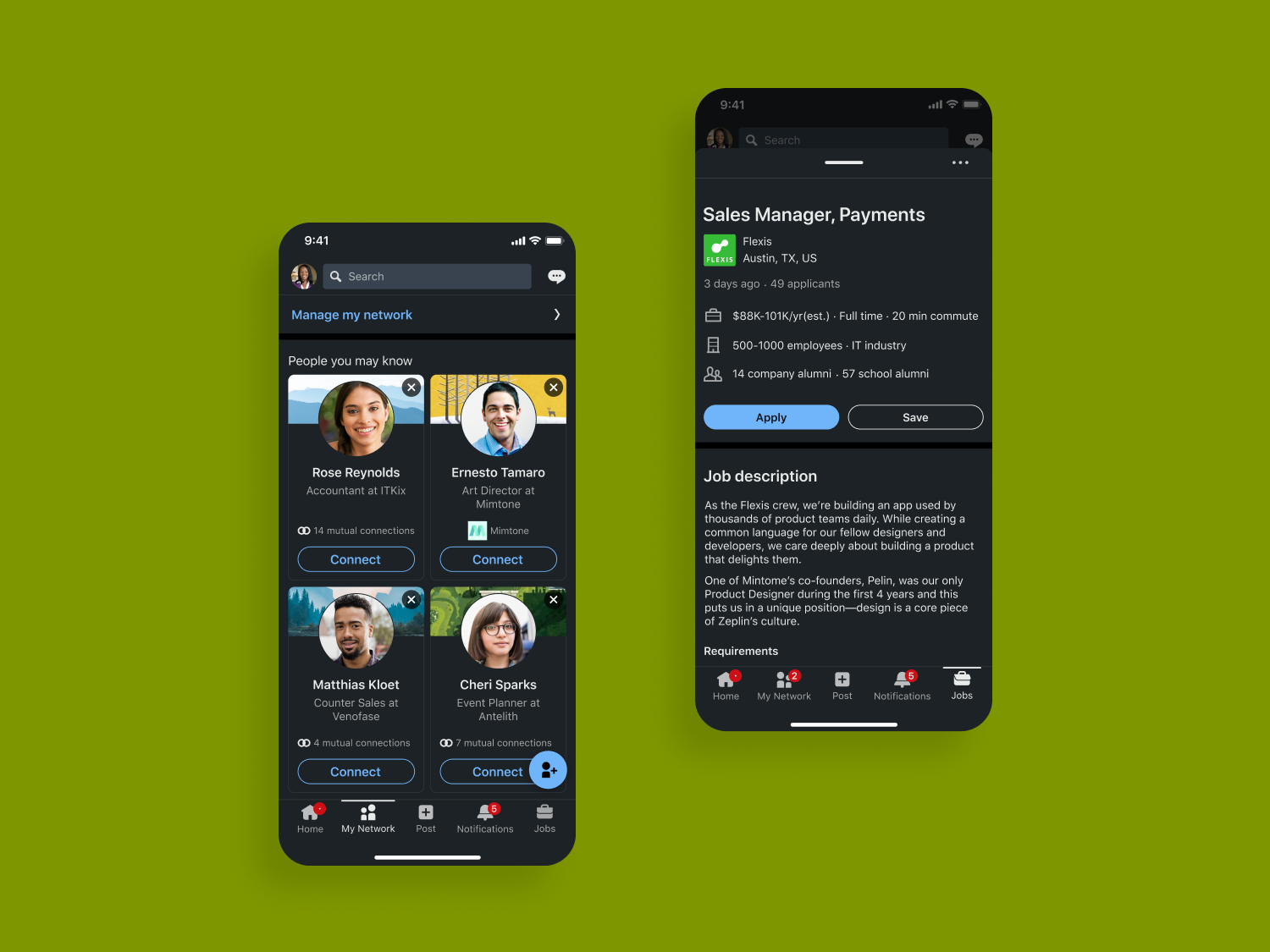
Led the development of design systems for web, iOS, and Android—delivering fully spec’d Figma components, defining motion parameters, and introducing an interactive prototype library to enhance engagement.
Built a Figma plugin that integrates real product data, and established scalable, inclusive design patterns with supporting documentation, onboarding, and Mercado training for cross-functional teams.
Focus area: Native, Components, Motion, Prototyping
ROLE
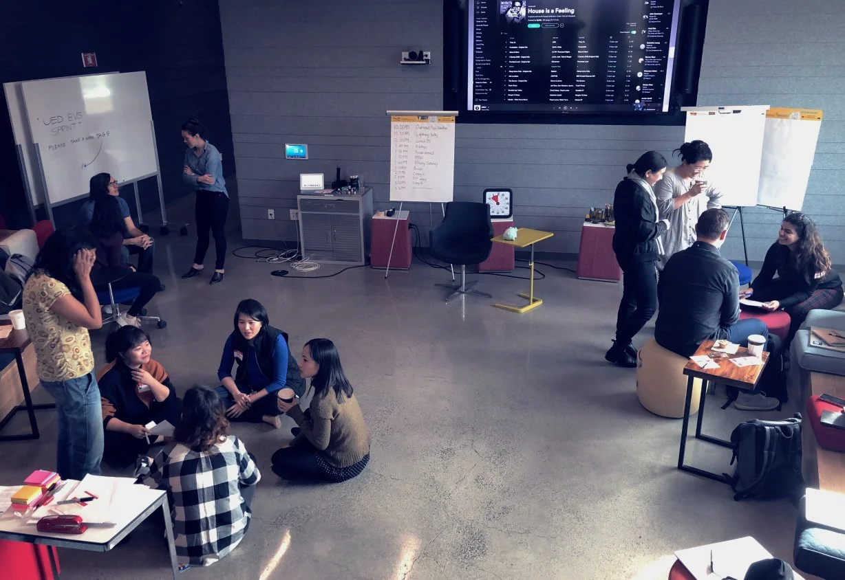
Design Lead - I led the new design system from start to finish. My most significant contribution was rolling how a new design language, best practices, and education to over 300 designers domestic and internationally.
CONSTRAINTS & CONSIDERATIONS
We have heard from users that LinkedIn's UI is too cluttered and they receive too many notifications.
USERS
New, frequent, and infrequent users of LinkedIn's consumer products.
DURATION
April 2017 - 2023
TOOLS
Figma and Protopie
PLATFORMS
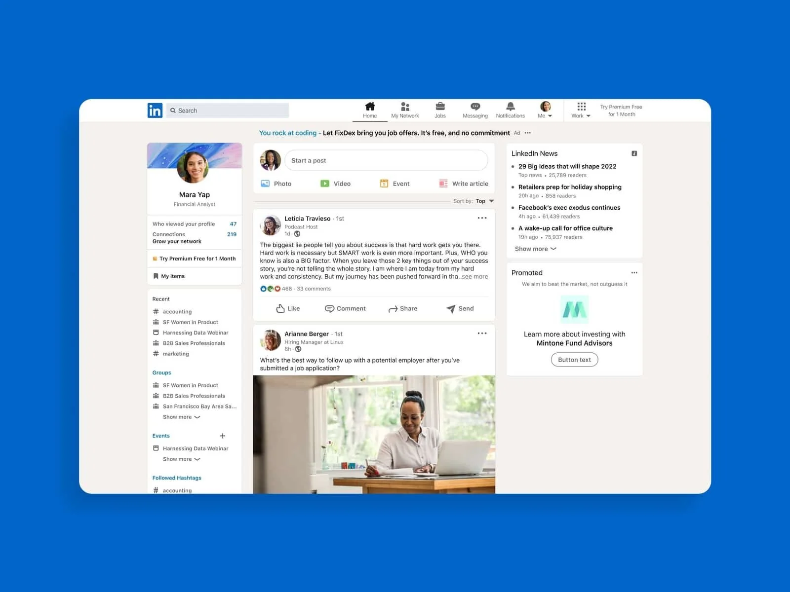
Native Mobile and Responsive web
PROBLEM
There were three related problems we were trying to solve:
As a user, I want to know about features that would help me get the most out of LinkedIn.
As a designer, I would like to know the right foundations and components to help my users accomplished their goals.
As a UX platform team, we would like to evaluate the quality and effectiveness of the design system for our JTBD (jobs to be done).
SOLUTION
LinkedIn content engines already match content with the right audience so users can engage with content they may find most valuable.
Suppose we introduce features to users at contextually relevant moments by guiding designers in identifying the right context, user, message type, and components while also evaluating how effective these are. In that case, we can provide lasting value to our users, helping them with their individual immediate and long-term goals and objectives on our platform.
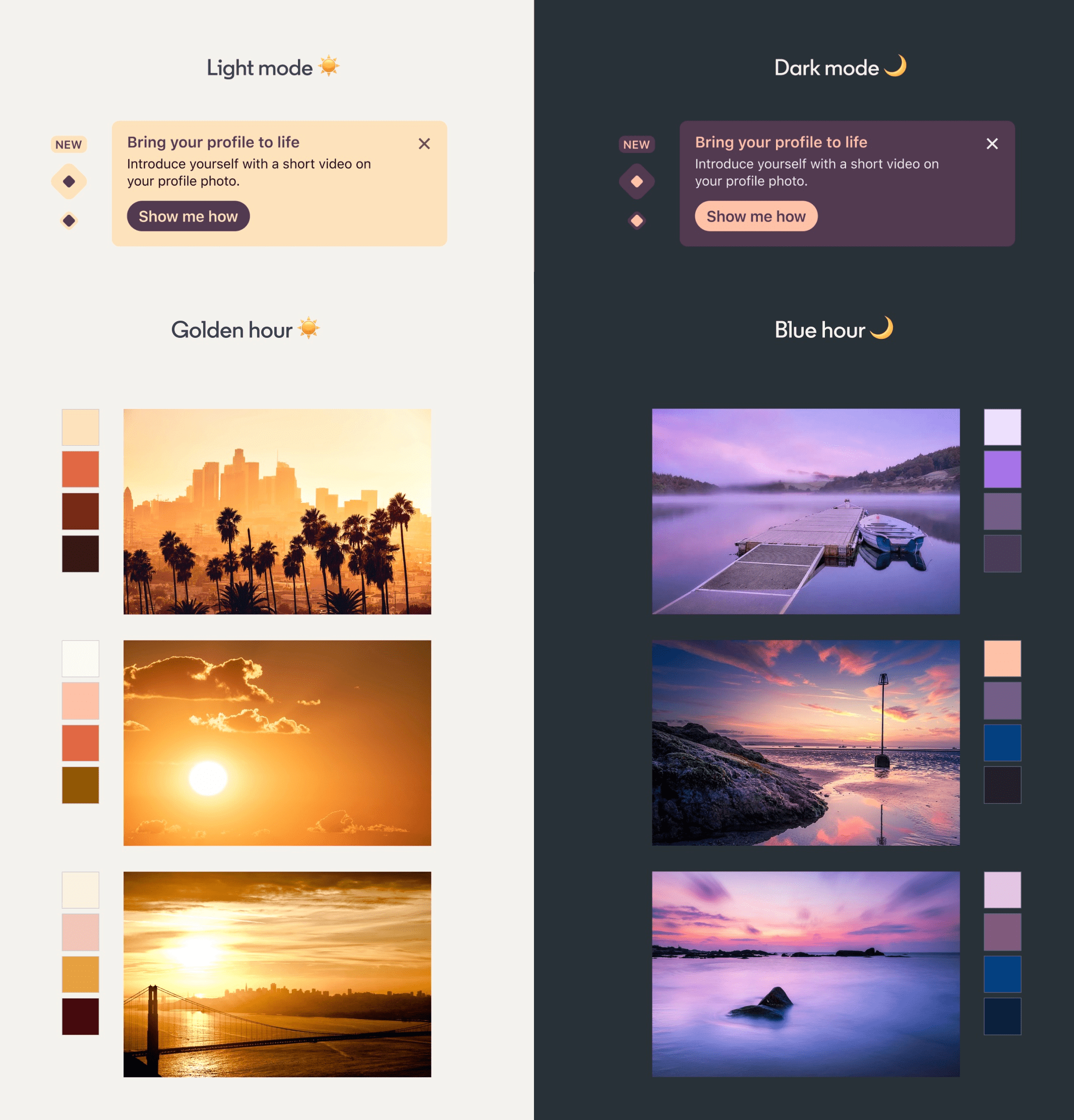
Brand & Foundations
Brand and foundational elements play a pivotal role in shaping the design system language, acting as the backbone for visual and interaction consistency. Core components like color, typography, grid systems, and spacing directly influence how the brand is experienced across products, ensuring alignment with its identity. These foundations not only establish visual clarity but also create a unified language that guides teams in crafting cohesive, recognizable experiences.
Incorporating these brand-driven foundations into a design system streamlines collaboration and decision-making. By embedding brand principles into reusable components and documentation, the system ensures that every product iteration upholds the brand’s integrity while allowing for creative flexibility within its defined boundaries.
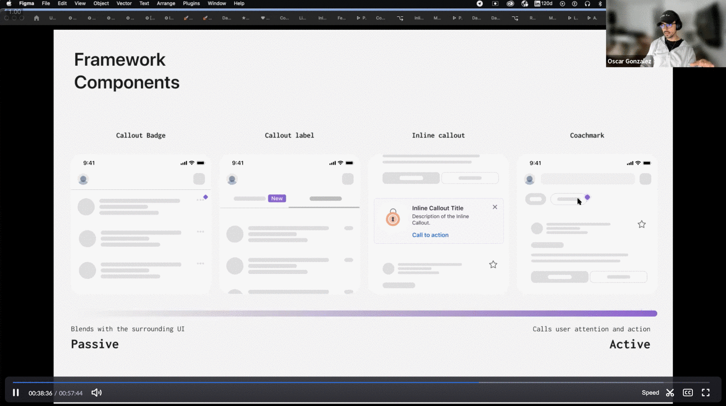
Components
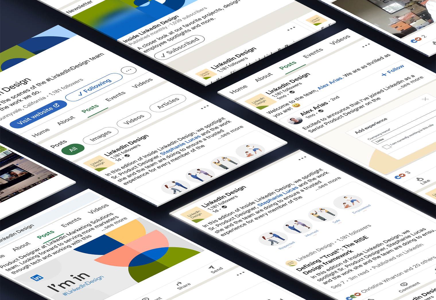
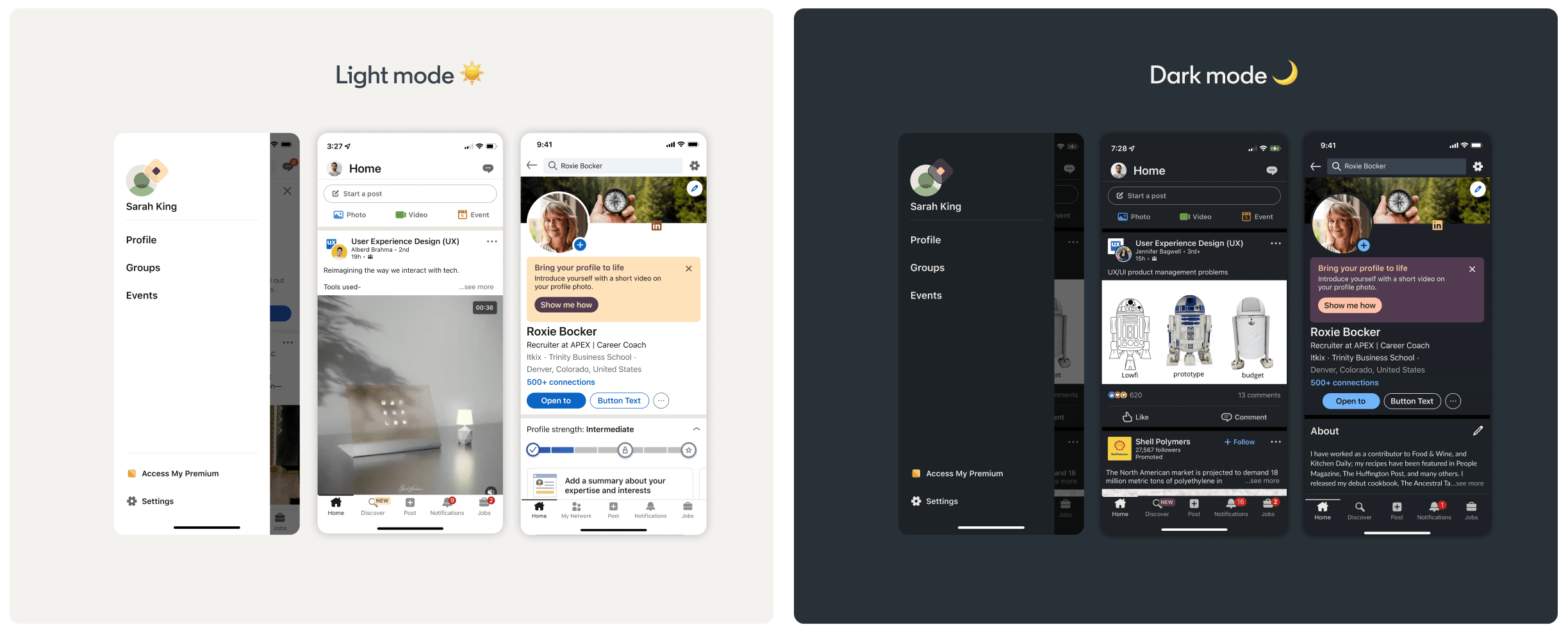
Components are the building blocks of a design system, offering a library of reusable, functional elements like buttons, cards, modals, and input fields. Each component is designed to be consistent and scalable, ensuring that products maintain visual and interactive harmony across different platforms. These components not only streamline the design process but also allow teams to implement and iterate quickly, maintaining efficiency while adhering to a unified system.
The strength of a component-driven design system lies in its flexibility and adaptability. By leveraging pre-built, well-documented components, teams can focus on creating user-centric solutions rather than starting from scratch. This approach accelerates development cycles while ensuring that all interfaces remain visually cohesive and aligned, no matter the product’s scale or complexity.
Guidelines & Education
A well-defined set of guidelines and educational resources is essential for enabling product designers, engineers, and brand teams to fully harness the potential of the design system. This section offers comprehensive best practices for implementing components, maintaining brand integrity, and ensuring accessibility across all products. By providing clear guidelines, teams are empowered to create cohesive user experiences while fostering collaboration and alignment across disciplines.
Moreover, the importance of ongoing education cannot be overstated. Regular workshops, training sessions, and easily accessible documentation keep product designers, engineers, and brand teams informed about updates and new features. By promoting a culture of continuous learning, organizations can enhance their teams’ understanding of the design system, ensuring that everyone is equipped to contribute to innovative and consistent product development.